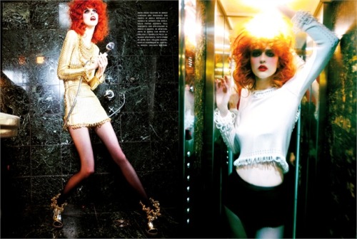
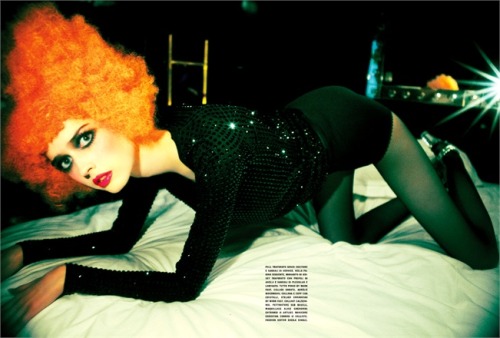
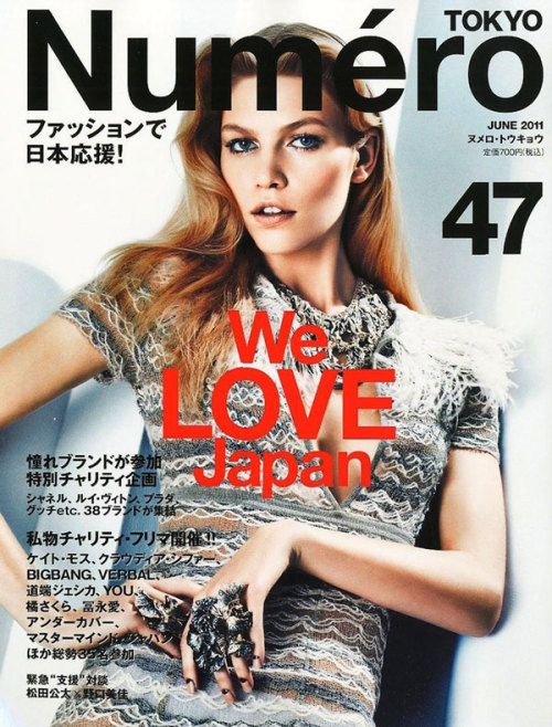
Maio nem começou e a Numéro Tokyo já divulgou sua capa de junho com uma lindíssima Aline Weber fotografada por Sebastian Kim!!! Vamos ver como ela virá nas campanhas da próxima temporada depois de bombar nos desfiles de inverno 2011.
By the way, ela voltou para o ranking das 50 modelos mais importantes do mundo do Models.com na posição 50. Vamos torcer para ela subir nele. Suerte girl!!!
***
"May not even started and already Numéro Tokyo unveiled its cover in June with a beautiful Aline Weber photographed by Sebastian Kim! Let's see how it will come in next season's campaign after pumping in winter 2011 fashion shows.
By the way, she returned to the ranking of the 50 models of the world's most important position on the Models.com 50. Let's hope she get on it. Suerte girl! (Translate by Google)"
**** moda * fotografia * pensatas * modelos * roupas * conversa de menino * boas compras ****
quarta-feira, abril 27, 2011
terça-feira, abril 19, 2011
Entenda o que rolou com a Arezzo...
Nos últimos dias o Twitter tupiniquim foi invadido por uma discussão meio last season, mas que fez barulho e resultou na retirada de produtos das lojas de uma das maiores redes de calçados femininos e acessórios do país, a Arezzo.
O fato foi o seguinte, a marca lançou na semana passada a campanha da nova coleção chamada de “Pelemania”, que trazia, segundo os comunicados divulgados pela marca, uma pequena parte da mesma utilizando peles de animais exóticos como coelhos e raposas.
Segundo a marca, todo o material utilizado é certificado e veio de viveiros no exterior, que tem todo um procedimento correto de criação, abate e manuseio. Se tudo isso se comprova, juro que não entendi toda a confusão em torno do tema.
Mais uma vez, acho que falou informação para a bloguesfera tuiteira que dá um simples Google e reprinta toda e qualquer informação, principalmente a da primeira página da pesquisa.
Ser sustentável significa utilizar da melhor forma possível e ao máximo aquele produto. Se no caso, os coelhos e raposas certificados foram criados em cativeiro, abatidos para consumo de suas carnes, porque não usar a pele? É super comum na França, por exemplo, encontrar carne desses animais nos supermercados! Assim como na Escandinávia é normal se comer alce e na Inglaterra pombas!!!
Você deve estar pensando que é nojento tudo isso... Pode até ser, mas todos esses animais foram criados em cativeiro e para abate, assim como a vaquinha e o querido salmão, que, a meu ver, sofre o processo de abate mais chocante!
Não defendo o uso de pele, mas sim a informação! Sou jornalista, pesquisa e apuração fazem parte do meu job! O que aconteceu nesse caso não foi a compra ilegal de pele de foca, mas sim um comércio regularizado e certificado...
Quanto a Arezzo, foi vítima da sua própria armadilha!!! Deveria conhecer melhor seu eleitorado. Quanto ao mundinho fashion, vergonha! A última temporada internacional foi uma das que mais apresentou peles nas coleções e ninguém bateu de frente desse jeito. Será efeito retardado.
Vale ainda lembrar que píton e jacaré também são animais, certo? Além da vaquinha, do carneirinho e do porquinho...
Não acho pele nada chique, só acho que não justifica toda essa confusão, sendo que todo esse mundinho endossou em suas resenhas a tendência lançada lá fora e copiada pela Arezzo. Veja aqui a entrevista do presidente da marca!
Para mim, chique é o kaiser Karl Lagerfeld, que usa pele falsa em todos os produtos da Chanel e cobra por eles o preço da mais alva pele de baby foca. Isso sim é poder... E tenho dito.
* Raquel Zimmermann em editorial da Vogue Paris de agosto de 2008 por Mario Testino. Editorial completo aqui.
***
"In recent days Twitter tupiniquim was invaded by a thread through last season, but that made noise and resulted in the withdrawal of products from the shops of one of the largest networks of women's footwear and accessories in the country, Arezzo.
The fact was this, the brand launched the campaign last week of a new collection called "Peleman," which brought, according to announcements released by the mark, a small part of it using the skins of exotic animals such as rabbits and foxes.
According to the brand, all material used is certified and come from farms overseas, which have all a correct breeding, slaughter and handling. If all this is proved, I swear I did not understand all the confusion surrounding the topic.
Again, I think I spoke to bloguesfera Twitterers information that gives a simple Google and reprint any and all information, especially on the first page of search results.
Being sustainable means using the best possible way and the most that product. If in case, rabbits and foxes bred in captivity certificates, slaughtered for their meat, why not use the skin? It is so common in France, for example, meat from these animals find in supermarkets! As is normal in Scandinavia, and moose eat pigeons in England!
You must be thinking that all this is disgusting ... Maybe so, but all these animals were bred in captivity and slaughter and the dear kitty and salmon, which, in my view, suffers from the slaughter process more shocking!
I do not advocate the use of fur, but information! I am a journalist, research and assessment are part of my job! What happened in this case was not the illegal purchase of sealskin, but a trade certificate and settled ...
As for Arezzo, was the victim of its own trap! Should know their constituents better. As for the little world of fashion, shame! The last international season was one that showed more skin in the collections and nobody to front like that. Will be delayed.
It is also worth remembering that python and alligator are animals too, right? Besides the cow, the lamb and the pig ...
I do not think skin nothing fancy, just do not think it justifies all this confusion, and this whole little world in his reviews endorsed the trend set out and copied by Arezzo. Here's interview with President of the mark!
For me it is the chic Kaiser Karl Lagerfeld, who uses fake fur at all Chanel products and they charge for the price of whiter skin of baby seals. Now that's power ... And I'm told. (Translated by Google)"
O fato foi o seguinte, a marca lançou na semana passada a campanha da nova coleção chamada de “Pelemania”, que trazia, segundo os comunicados divulgados pela marca, uma pequena parte da mesma utilizando peles de animais exóticos como coelhos e raposas.
Segundo a marca, todo o material utilizado é certificado e veio de viveiros no exterior, que tem todo um procedimento correto de criação, abate e manuseio. Se tudo isso se comprova, juro que não entendi toda a confusão em torno do tema.
Mais uma vez, acho que falou informação para a bloguesfera tuiteira que dá um simples Google e reprinta toda e qualquer informação, principalmente a da primeira página da pesquisa.
Ser sustentável significa utilizar da melhor forma possível e ao máximo aquele produto. Se no caso, os coelhos e raposas certificados foram criados em cativeiro, abatidos para consumo de suas carnes, porque não usar a pele? É super comum na França, por exemplo, encontrar carne desses animais nos supermercados! Assim como na Escandinávia é normal se comer alce e na Inglaterra pombas!!!
Você deve estar pensando que é nojento tudo isso... Pode até ser, mas todos esses animais foram criados em cativeiro e para abate, assim como a vaquinha e o querido salmão, que, a meu ver, sofre o processo de abate mais chocante!
Não defendo o uso de pele, mas sim a informação! Sou jornalista, pesquisa e apuração fazem parte do meu job! O que aconteceu nesse caso não foi a compra ilegal de pele de foca, mas sim um comércio regularizado e certificado...
Quanto a Arezzo, foi vítima da sua própria armadilha!!! Deveria conhecer melhor seu eleitorado. Quanto ao mundinho fashion, vergonha! A última temporada internacional foi uma das que mais apresentou peles nas coleções e ninguém bateu de frente desse jeito. Será efeito retardado.
Vale ainda lembrar que píton e jacaré também são animais, certo? Além da vaquinha, do carneirinho e do porquinho...
Não acho pele nada chique, só acho que não justifica toda essa confusão, sendo que todo esse mundinho endossou em suas resenhas a tendência lançada lá fora e copiada pela Arezzo. Veja aqui a entrevista do presidente da marca!
Para mim, chique é o kaiser Karl Lagerfeld, que usa pele falsa em todos os produtos da Chanel e cobra por eles o preço da mais alva pele de baby foca. Isso sim é poder... E tenho dito.
* Raquel Zimmermann em editorial da Vogue Paris de agosto de 2008 por Mario Testino. Editorial completo aqui.
***
"In recent days Twitter tupiniquim was invaded by a thread through last season, but that made noise and resulted in the withdrawal of products from the shops of one of the largest networks of women's footwear and accessories in the country, Arezzo.
The fact was this, the brand launched the campaign last week of a new collection called "Peleman," which brought, according to announcements released by the mark, a small part of it using the skins of exotic animals such as rabbits and foxes.
According to the brand, all material used is certified and come from farms overseas, which have all a correct breeding, slaughter and handling. If all this is proved, I swear I did not understand all the confusion surrounding the topic.
Again, I think I spoke to bloguesfera Twitterers information that gives a simple Google and reprint any and all information, especially on the first page of search results.
Being sustainable means using the best possible way and the most that product. If in case, rabbits and foxes bred in captivity certificates, slaughtered for their meat, why not use the skin? It is so common in France, for example, meat from these animals find in supermarkets! As is normal in Scandinavia, and moose eat pigeons in England!
You must be thinking that all this is disgusting ... Maybe so, but all these animals were bred in captivity and slaughter and the dear kitty and salmon, which, in my view, suffers from the slaughter process more shocking!
I do not advocate the use of fur, but information! I am a journalist, research and assessment are part of my job! What happened in this case was not the illegal purchase of sealskin, but a trade certificate and settled ...
As for Arezzo, was the victim of its own trap! Should know their constituents better. As for the little world of fashion, shame! The last international season was one that showed more skin in the collections and nobody to front like that. Will be delayed.
It is also worth remembering that python and alligator are animals too, right? Besides the cow, the lamb and the pig ...
I do not think skin nothing fancy, just do not think it justifies all this confusion, and this whole little world in his reviews endorsed the trend set out and copied by Arezzo. Here's interview with President of the mark!
For me it is the chic Kaiser Karl Lagerfeld, who uses fake fur at all Chanel products and they charge for the price of whiter skin of baby seals. Now that's power ... And I'm told. (Translated by Google)"
segunda-feira, abril 18, 2011
Inspire-se Man #4
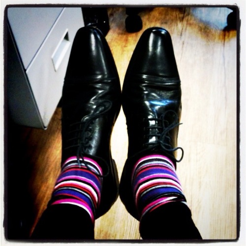
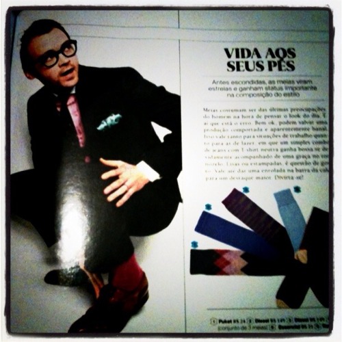
Moda entre os ingleses há muito tempo, as meias coloridas ganharam uma notinha na primeira edição da GQ Brasil. Eu, particularmente, gosto bastante e costumo usar com looks sociais. Acho interessante para quebrar a sobriedade. Gosto, por exemplo, quando se cruza a perda e ali aparece uma corsinha. Vale apostar!!! A foto acima sou eu no trabalho. Meia listada para quebrar a sobriedade do costume (terno sem colete) preto com camisa azul. Abaixo, a notinha da revista.

***
"Fashion among the English long, colorful socks gained a little note in the first edition of GQ Brazil. I particularly like a lot and I use with social looks. I find it interesting to break sobriety. Like, for example, when it crosses the loss and there appears a corsinha. Vale bet! The photo above is me at work. Half listed to break the habit of sobriety (suit without a vest) with black shirt blue. Below, a little note of the magazine. (Translated by Google)"
***
"Fashion among the English long, colorful socks gained a little note in the first edition of GQ Brazil. I particularly like a lot and I use with social looks. I find it interesting to break sobriety. Like, for example, when it crosses the loss and there appears a corsinha. Vale bet! The photo above is me at work. Half listed to break the habit of sobriety (suit without a vest) with black shirt blue. Below, a little note of the magazine. (Translated by Google)"
sexta-feira, abril 15, 2011
Vogue Itália & ANTP presents Ann Ward
Juro que achei que não ia sair.
Está no site da Vogue Itália o perfil e o editorial prometidos a ganhadora da 15ª edição do America’s Next Top Model goes high fashion, que foi animal, por sinal. Ann Ward foi fotografada por Ellen von Unwerth para edição de março da publicação. Agora é esperar para ver a capa e o editorial do suplemento de beleza.
Falando em ANTP, a edição 16, também high fashion, já está rolando na TV americana. Vale conferir!!!
***
"I swear I thought I would not leave. It is in the web site of Italian Vogue editorial profile and promised the winner of the 15th edition of America's Next Top Model goes high fashion, which was awesome by the way, worth watching. Ann Ward was shot by Ellen von Unwerth for the March edition of the publication. Now, we expect to see the cover and editorial supplement of beauty.
Speaking of ANTP, issue 16, also high fashion, is already rolling on American TV. It is worth checking! (Translated by Google)"
Está no site da Vogue Itália o perfil e o editorial prometidos a ganhadora da 15ª edição do America’s Next Top Model goes high fashion, que foi animal, por sinal. Ann Ward foi fotografada por Ellen von Unwerth para edição de março da publicação. Agora é esperar para ver a capa e o editorial do suplemento de beleza.
Falando em ANTP, a edição 16, também high fashion, já está rolando na TV americana. Vale conferir!!!
***
"I swear I thought I would not leave. It is in the web site of Italian Vogue editorial profile and promised the winner of the 15th edition of America's Next Top Model goes high fashion, which was awesome by the way, worth watching. Ann Ward was shot by Ellen von Unwerth for the March edition of the publication. Now, we expect to see the cover and editorial supplement of beauty.
Speaking of ANTP, issue 16, also high fashion, is already rolling on American TV. It is worth checking! (Translated by Google)"
quinta-feira, abril 14, 2011
Conversa de menino #14
Já ouviu falar em color blocking?
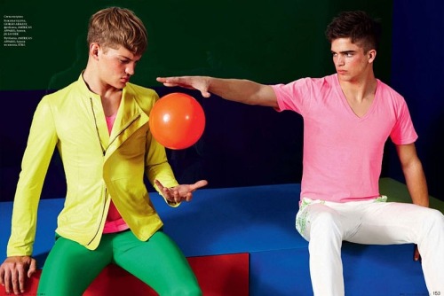
O tema, destacado no post anterior sobre a atrasada cobertura da Elle Brasil, foi destaque nos desfiles Europeus de verão 2011, tanto no masculino como no feminino, e vem cada vez mais ganhando as ruas e os editoriais de moda.
A tendência consiste em colocar junto blocos de cores, normalmente cores sólidas, o que acaba sendo perfeito para o verão.
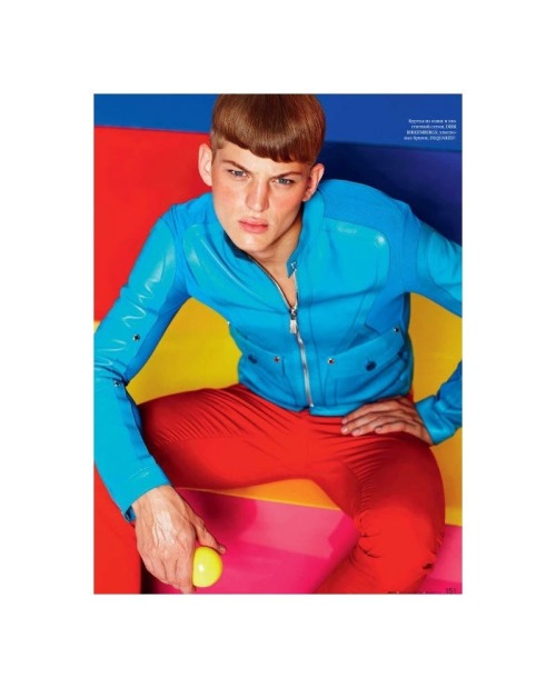
Para ilustrar melhor, a GQ Rússia fez um editorial na edição de abril bastante usável mostrando a melhor forma de se explorar a tendência. Vejamos...
Aqui, cor forte se equilibra com um tom mais claro, sendo quebrado e ao mesmo tempo aceso (destacado) pela sandália com toque fluo.
O equilíbrio de cores também se repete aqui, destaque que sempre a cor mais viva sobre para a parte de cima do look. Não sei exatamente o porquê desse uso. Talvez seja para não aumentar a silhueta.
Nessa mistura, clássicos como azul e vermelho, verde e amarelo, verde e rosa, laranja e amarelo.
Agora, falando em passarela, a brilhante marca Jil Sander explorou a tendência em Milão na apresentação de verão 2011, que rolou em janeiro e chega agora nas lojas no hemisfério norte. Confira as imagens do desfile aqui. Aqui no Brasil, uma espécie de color blocking apareceu no desfile de inverno 2011 de Ricardo Almeida, que rolou a semana passada (imagens aqui).
DICA: Agora, na vida real, precisa ter um pouco de cuidado. Cor normalmente aumenta o tamanho da pessoa. Então, meninos, se estiverem um pouco mais fofinhos, usem o bom senso, certo? Nada de ficar desfilando por aí como uma bola colorida!!!
***
"Do you ever heard of color blocking?
The tredy highlighted in the previous post on the latest cover of Elle Brazil, was highlighted in the European summer 2011 fashion shows, both in males as in females, and is increasingly hitting the streets and fashion editorials.
The tendency is to put together blocks of color, usually solid colors, which ends up being perfect for the summer.
To illustrate further, GQ Russia made an editorial quite usable showing how best to exploit the trend. Let's see...
Here, strong color is balanced with a lighter tone, being broken while on (highlighted) by fluo sandal with a touch.
The color balance is also repeated here, highlight the color more than ever to live on top of the look. I do not know exactly why such use. Maybe not to increase the silhouette.
In this mix, like classic blue and red, green and yellow, green and pink, orange and yellow.
Speaking on the catwalk, the brilliant brand Jil Sander explored the trend on the catwalks of Milan in summer 2011 presentation, which took place in January and now arrives in stores in the northern hemisphere. Check out the images of the parade here. Here in Brazil, the trend appeared in the parade of Ricardo Almeida, who rolled last week. (Translated by Google)"
O tema, destacado no post anterior sobre a atrasada cobertura da Elle Brasil, foi destaque nos desfiles Europeus de verão 2011, tanto no masculino como no feminino, e vem cada vez mais ganhando as ruas e os editoriais de moda.
A tendência consiste em colocar junto blocos de cores, normalmente cores sólidas, o que acaba sendo perfeito para o verão.
Para ilustrar melhor, a GQ Rússia fez um editorial na edição de abril bastante usável mostrando a melhor forma de se explorar a tendência. Vejamos...
Aqui, cor forte se equilibra com um tom mais claro, sendo quebrado e ao mesmo tempo aceso (destacado) pela sandália com toque fluo.
O equilíbrio de cores também se repete aqui, destaque que sempre a cor mais viva sobre para a parte de cima do look. Não sei exatamente o porquê desse uso. Talvez seja para não aumentar a silhueta.
Nessa mistura, clássicos como azul e vermelho, verde e amarelo, verde e rosa, laranja e amarelo.
Agora, falando em passarela, a brilhante marca Jil Sander explorou a tendência em Milão na apresentação de verão 2011, que rolou em janeiro e chega agora nas lojas no hemisfério norte. Confira as imagens do desfile aqui. Aqui no Brasil, uma espécie de color blocking apareceu no desfile de inverno 2011 de Ricardo Almeida, que rolou a semana passada (imagens aqui).
DICA: Agora, na vida real, precisa ter um pouco de cuidado. Cor normalmente aumenta o tamanho da pessoa. Então, meninos, se estiverem um pouco mais fofinhos, usem o bom senso, certo? Nada de ficar desfilando por aí como uma bola colorida!!!
***
"Do you ever heard of color blocking?
The tredy highlighted in the previous post on the latest cover of Elle Brazil, was highlighted in the European summer 2011 fashion shows, both in males as in females, and is increasingly hitting the streets and fashion editorials.
The tendency is to put together blocks of color, usually solid colors, which ends up being perfect for the summer.
To illustrate further, GQ Russia made an editorial quite usable showing how best to exploit the trend. Let's see...
Here, strong color is balanced with a lighter tone, being broken while on (highlighted) by fluo sandal with a touch.
The color balance is also repeated here, highlight the color more than ever to live on top of the look. I do not know exactly why such use. Maybe not to increase the silhouette.
In this mix, like classic blue and red, green and yellow, green and pink, orange and yellow.
Speaking on the catwalk, the brilliant brand Jil Sander explored the trend on the catwalks of Milan in summer 2011 presentation, which took place in January and now arrives in stores in the northern hemisphere. Check out the images of the parade here. Here in Brazil, the trend appeared in the parade of Ricardo Almeida, who rolled last week. (Translated by Google)"
quinta-feira, abril 07, 2011
Revista 2: Vogue Paris X Elle Brasil
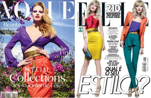
Quatro meses depois, a Elle Brasil de abril traz a tendência (color blocking) que a Vogue Paris deu na capa de fevereiro (divulgada em janeiro). Atrasada! Será?
***
"Four months later, Elle Brazil April brings the trend that has given Paris Vogue on the cover of February (released in January). (Translated by Google)"
***
"Four months later, Elle Brazil April brings the trend that has given Paris Vogue on the cover of February (released in January). (Translated by Google)"
Revista: Fiasco Magazine
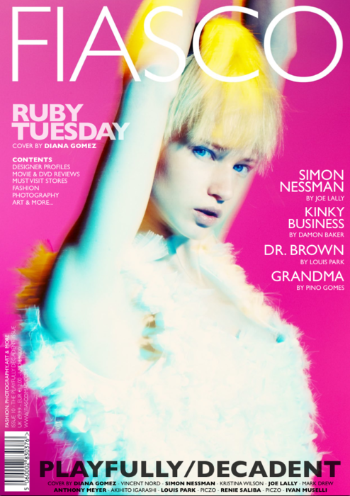
Hoje, meio sem querer, descobri que uma das revistas que mais gosto, a Fiasco, tem edição online completinha. Veja aqui a edição de março chamada de Playfully/Decadent. Editoriais perfeitos, tanto masculinos quanto femininos. Vale perder uma boa hora vendo a revista, viu!!!
***
"Today, half unwittingly discovered that one of my favorite magazines, the Fiasco, has completinha online edition. Here's the March issue called Playfully/Decadent. Editorials perfect, both male and female. Worth losing a good time seeing the magazine. (Translated by Google)"
terça-feira, abril 05, 2011
Inspire-se - Jak & Jil
Apesar das fotos serem carregadas de informação de moda, referência para super iniciados, o frescor das imagens criadas por Tommy Ton (Jak & Jil) inspiram qualquer um que adore moda. É ver com cuidado trazer para o dia-a-dia o que é possível!!! Diversão garantida!
***
"Although the pictures are full of fashion information, refer to super start, the freshness of the images created by Tommy Ton inspire anyone who loves fashion. You see with care to bring the day to day what is possible! Guaranteed fun! (Translated by Google)"
***
"Although the pictures are full of fashion information, refer to super start, the freshness of the images created by Tommy Ton inspire anyone who loves fashion. You see with care to bring the day to day what is possible! Guaranteed fun! (Translated by Google)"
segunda-feira, abril 04, 2011
Conversa de menino #13
Como sempre recebo várias emails pedido ajuda com o look para o trabalho, hoje, o post do Conversa será sobre esse assunto tão gostosamente irritante. Vamos lá.
Escolher roupa de trabalho é um pouco complicado, mas nada que um pouco de atenção não resolva. Atenção sim, porque ela não precisa, em primeiro lugar, ser fashion, mas adequada ao ambiente. Então, regra número zero, ver como os outros colegas estão vestidos e entender o dress code da empresa; se todos vão de social, não é você que vai ser bermuda só porque as revistas de moda estão dizendo ser a última tendência.
Isso elimina qualquer erro de conduta. Agora a dúvida é, quando não há uma coisa rígida, como o meu trabalho, como jornalista. Aí é necessário bom senso. Para entender melhor, vou explicar um pouquinho meu estilo e duas variações, que deve caber para vários de vocês.
Social – quando há reuniões externas ou visita aos clientes, costume (terno sem colete) é a pedida. Vario entre o clássico preto e entre dois mais modernos cinza. Nos últimos tempos ando quebrando a rigidez do look com o não uso de cinto e gravata. Sapato de amarrar é a pedida. Uma opção é calça social + camisa + sapato de amarrar, mas só uso em dias mais frios que dá para jogar um cardigã ou uma malha decote V por cima. Aí vale até uma gravatinha fininha - as com texturas são as escolhidas da vez!!!
Fashion – depende de como está a semana (se fico na agência ou se vou ter que sair para algum meeting), opto por um look mais fashion, as sextas, normalmente, que é o dia oficial do “casual friday”. Nesse dia vale de tudo, menos o que não é permitido na maioria das empresas e não parece profissional, como bermudas, tênis de academia, decotes V muito profundos, camisetas de time de futebol, etc. Seja original, mas não ousei a ponto de ser chamado a atenção por não estar adequado, certo, procure ser você mesmo!!!
Agora uma listinha que vale para todo mundo do que é definitivamente proibido usar no trabalho, seja ele qual for:
- bermudas
- regatas
- estampas marcantes
- tênis de academia e de molas
- cores fortes
- calça de moletom ou em tecido muito molengo
- roupas muito justas
- decotes profundos
- qualquer coisa na cabeça (boné, boina, gorro etc.)
- correntes e colares
- calça xadrez
***
"As always get several emails requesting assistance with the look for work, today's post will talk about it so heartily annoying. Come on.
Choose work clothes is a bit complicated, but nothing that a little attention can not help. Attention yes, because she does not need, first, be fashionable, but appropriate to the environment. So rule number zero, see how other colleagues are dressed and understand the company's dress code, if everyone goes to social, are not you going to be shorts just because the fashion magazines are claiming to be the latest trend.
This eliminates any misconduct. Now the question is, when there is not a rigid thing, as my work as a journalist. Then you need common sense. To understand better, I'll explain a bit my style, and two variations, which should fit for several of you.
Casual - on most days of the week prevails in my casual style. Use and abuse of the very poles striped or solid shirts (always mild) and t the most basic, without much pattern. This combined with jeans and sneakers Osklen style. When I go tidy, change the shirt for the shirt - I love the white and the stripes, I think work really well. What also works is dress shirt with jeans.
When it is cooler, thin knit cardigan or V-neckline in complete the look. I really like also to play a sweatshirt zipper on top, despite opinion means released, with the rest more tidy, it looks and fashion makeup.
Social - when there are meetings or visiting customers, costume (suit without a vest) is requested. Fluctuate between the classic black and between two modern gray. Recently breaking walk a tight look with not using a seat belt and tie. Shoe tie is requested. One option is slacks + shirt + tie shoe, but only use on cold days that you can throw a cardigan or a V neck knit on top. There valley to a thin bowtie.
Fashion - depends on how is the week, opt for a more fashionable look, Fridays, usually, which is the official day of "casual friday". That day is worth everything except what is not allowed in most companies and does not seem professional, such as shorts, tennis academy, V necklines too deep, team shirts, etc..
Now a short list that goes for everyone of what is definitely forbidden to use at work, whatever it is:
- Bermuda
- Regattas
- Striking prints
- Tennis academy and spring
- Strong colors
- Sweatpants or too soft tissue
- Tight-fitting clothing
- Deep cleavage
- Anything in the head (cap, beret, cap etc).
- Chains and necklaces (Translated by Google)"
Escolher roupa de trabalho é um pouco complicado, mas nada que um pouco de atenção não resolva. Atenção sim, porque ela não precisa, em primeiro lugar, ser fashion, mas adequada ao ambiente. Então, regra número zero, ver como os outros colegas estão vestidos e entender o dress code da empresa; se todos vão de social, não é você que vai ser bermuda só porque as revistas de moda estão dizendo ser a última tendência.
Casual – na maioria dos dias de semana prevalece o casual no meu estilo. Uso e abuso bastante das camisetas pólos lisas ou listradas (sempre discretas) e das camisetas mais básicas, sem muita estampa. Isso combinado com calça jeans e tênis estilo Osklen. Quando quero ir mais arrumadinho, troco a camiseta pela camisa – adoro as brancas e as listradas, acho que funcionam super bem. O que também funciona é camisa social com calça jeans.
Quando está mais frio, cardigã ou malha fininha em decote V completa o look. Gosto bastante também de jogar um moletom de zíper por cima, apesar parecer meio largado, com todo o resto mais arrumadinho, dá um ar bem fashion a composição.
Agora uma listinha que vale para todo mundo do que é definitivamente proibido usar no trabalho, seja ele qual for:
- bermudas
- regatas
- estampas marcantes
- tênis de academia e de molas
- cores fortes
- calça de moletom ou em tecido muito molengo
- roupas muito justas
- decotes profundos
- qualquer coisa na cabeça (boné, boina, gorro etc.)
- correntes e colares
- calça xadrez
***
"As always get several emails requesting assistance with the look for work, today's post will talk about it so heartily annoying. Come on.
Choose work clothes is a bit complicated, but nothing that a little attention can not help. Attention yes, because she does not need, first, be fashionable, but appropriate to the environment. So rule number zero, see how other colleagues are dressed and understand the company's dress code, if everyone goes to social, are not you going to be shorts just because the fashion magazines are claiming to be the latest trend.
This eliminates any misconduct. Now the question is, when there is not a rigid thing, as my work as a journalist. Then you need common sense. To understand better, I'll explain a bit my style, and two variations, which should fit for several of you.
Casual - on most days of the week prevails in my casual style. Use and abuse of the very poles striped or solid shirts (always mild) and t the most basic, without much pattern. This combined with jeans and sneakers Osklen style. When I go tidy, change the shirt for the shirt - I love the white and the stripes, I think work really well. What also works is dress shirt with jeans.
When it is cooler, thin knit cardigan or V-neckline in complete the look. I really like also to play a sweatshirt zipper on top, despite opinion means released, with the rest more tidy, it looks and fashion makeup.
Social - when there are meetings or visiting customers, costume (suit without a vest) is requested. Fluctuate between the classic black and between two modern gray. Recently breaking walk a tight look with not using a seat belt and tie. Shoe tie is requested. One option is slacks + shirt + tie shoe, but only use on cold days that you can throw a cardigan or a V neck knit on top. There valley to a thin bowtie.
Fashion - depends on how is the week, opt for a more fashionable look, Fridays, usually, which is the official day of "casual friday". That day is worth everything except what is not allowed in most companies and does not seem professional, such as shorts, tennis academy, V necklines too deep, team shirts, etc..
Now a short list that goes for everyone of what is definitely forbidden to use at work, whatever it is:
- Bermuda
- Regattas
- Striking prints
- Tennis academy and spring
- Strong colors
- Sweatpants or too soft tissue
- Tight-fitting clothing
- Deep cleavage
- Anything in the head (cap, beret, cap etc).
- Chains and necklaces (Translated by Google)"
quarta-feira, março 30, 2011
Editorial comentado #2
Ao invés de um editorial com várias páginas, apenas uma imagem que representa bem um estilo e traz bastante referência de moda sem deixar de ser usável. Versátil, cabe em diversos ambientes, desde o de trabalho (mais informal) a uma noite de balada. Também fica super bacana para ficar de boa.
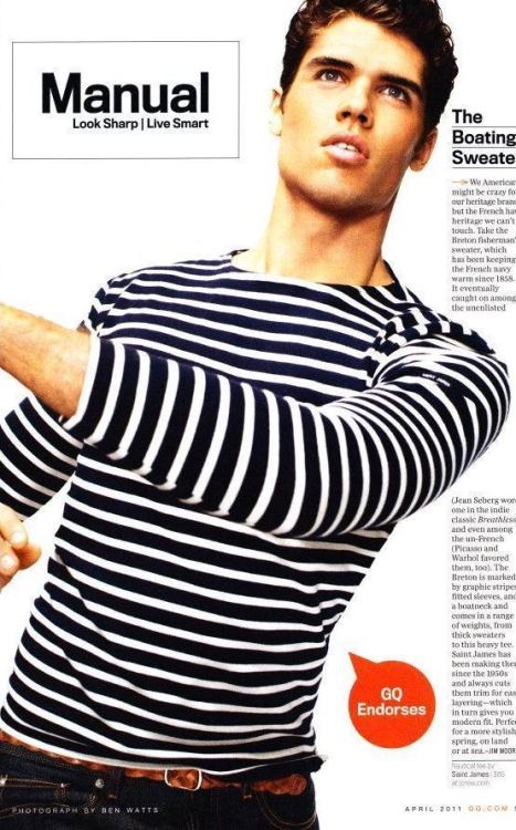
Das tendências de moda. Jeans escuro com malha navy, um clássico que sempre fica bom! O bacana é que as referências, apesar de claras, não gritam. Para uma pessoa que não entende de moda verá ali apenas uma camiseta de manga longa listrada. O que é bom!
Detalhe para o cinto trançado mais claro. Bacana e quebra o look, criando, ali, mais uma listra (ótima ideia). Também gosto da opção de cinto de corda listrado de outra cor (possibilidade de mudar esse look). Outro ponto forte é o cabelo do modelo mais cheinho, a cara do inverno europeu (tendência que vem forte - apareceu em todos os desfiles masculinos de Milão e Paris).
Só para constar, a foto está na GQ americana de abril.
***
"Instead of an editorial with multiple pages, just a picture that represents a good enough reference brings style and fashion while still usable. Versatile, it fits in many environments, from a more casual work at a night club. It also is super cool to be good.
Fashion trends. Dark jeans with navy knit, a classic that always looks good! The cool thing is that the references, although clear, do not cry. For a person who does not understand fashion there will see only a long sleeve striped shirt.
Details for the braided belt clearer. Cool and break the look, creating there, another stripe. He also likes the option of striped rope belt of another color. Another strong point is the model's hair more chubby, face the European winter.
For the record, the photo is in the U.S. GQ April. (Translated by Google)"
Das tendências de moda. Jeans escuro com malha navy, um clássico que sempre fica bom! O bacana é que as referências, apesar de claras, não gritam. Para uma pessoa que não entende de moda verá ali apenas uma camiseta de manga longa listrada. O que é bom!
Detalhe para o cinto trançado mais claro. Bacana e quebra o look, criando, ali, mais uma listra (ótima ideia). Também gosto da opção de cinto de corda listrado de outra cor (possibilidade de mudar esse look). Outro ponto forte é o cabelo do modelo mais cheinho, a cara do inverno europeu (tendência que vem forte - apareceu em todos os desfiles masculinos de Milão e Paris).
Só para constar, a foto está na GQ americana de abril.
***
"Instead of an editorial with multiple pages, just a picture that represents a good enough reference brings style and fashion while still usable. Versatile, it fits in many environments, from a more casual work at a night club. It also is super cool to be good.
Fashion trends. Dark jeans with navy knit, a classic that always looks good! The cool thing is that the references, although clear, do not cry. For a person who does not understand fashion there will see only a long sleeve striped shirt.
Details for the braided belt clearer. Cool and break the look, creating there, another stripe. He also likes the option of striped rope belt of another color. Another strong point is the model's hair more chubby, face the European winter.
For the record, the photo is in the U.S. GQ April. (Translated by Google)"
Esse post talvez esteja fora de hora, mas não senti necessidade de fazê-lo no momento do lançamento da coleção, já que toda a bloguesfera estava comentando eufórica o assunto. Nem vou falar das roupas aqui, pois, pelo que parece, já estão esgotada.
Só queria deixar registrado que parcerias como essa são muito importantes e precisam ocorrer mais por aqui. Também mostra a importância do Brasil no cenário econômico e estratégico mundial. Quem poderia pensar anos atrás que uma estilista como Stella McCartney lançaria uma coleção fast fashion exclusivamente para o Brasil? Veja coleção aqui.
Gosto e aprovo. Tomara que venham outras!!!
Só para registrar, das já lançadas por aqui, tenho peças do Sérgio K para C&A (camisetas, bermuda, cintos e tênis) e Oskar Metsavaht para Riachuelo (camisetas e tênis) no meu guarda-roupa e posso afirmar que valeu a compra.
Qual o próximo estilista que você gostaria de ver nas araras das fast fashions tupiniquins? Eu gostaria de Reserva (nacional) e Tom Ford (internacional).
***
"This post might be out of hours, but felt no need to do it at the time of the launch of the collection, since all the euphoric bloguesfera was commenting the issue. I will not speak of the clothes here, because, it seems, are already sold out.
Just wanted to register that partnerships like this are very important and need to occur more here. It also shows the importance of Brazil in the global economic and strategic. Who would have thought years ago that a designer like Stella McCartney will launch a fast fashion collection exclusively for Brazil?
Taste and approve. Hopefully others will!
For the record, those already posted here, have pieces of Sergio K for C&A (shirts, shorts, belts and shoes) and Oskar Metsavaht for Riachuelo (shirts and shoes) in my wardrobe and I can say it was worth the purchase.
What next stylist you like to see the rails of fast tupiniquins fashions? I would like to see Reserva (national) and Tom Ford (international). (Translated by Google)"
terça-feira, março 29, 2011
Finalmente GQ Brasil ou quase lá!
Quem estava esperando uma Bíblia de moda comercial, como quem vos escreve aqui, ficou um pouco chateado com o que viu, apesar de espantando com a qualidade de algumas seções, principalmente na versão iPad. A de exercícios, por exemplo, ficou incrível com o vídeo dos primeiros movimentos de cada série.
Não sei se esse primeiro número foi feito para bater de frente com a VIP ou se a revista seguirá essa pegada (espero que não), mas existe ali muito campo e potencial para crescer e inovar, principalmente se a revista entender que existe uma grande faixa de mercado aí de vinte e poucos anos que se alimenta basicamente do que é publicado em blogs.
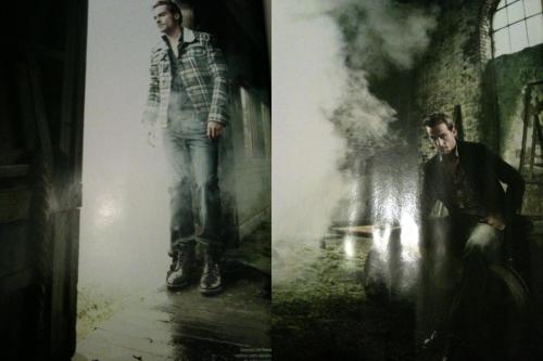
De todas as seções a que mais me deixou chocado, e não foi no bom sentido, foi a nossa querida editoria de moda. Explico, por ser uma revista que deveria tratar a moda com um cuidado especial e destaque, jogou muito no seguro, e, ao invés de inspirar, não provocou desejo algum.
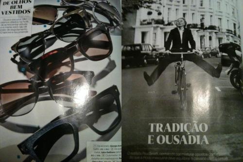
Chamada de Manual, a seção se perde no que poderia ser exitoso. Várias páginas com acessórios variados que me fazem pensar no que virá no mês que vem, já que nessa edição foi tratado de lenços, meias e óculos de sol. Faltou um pouco de brain aí para inovar. Acho incrível, por exemplo, a seção Dig the new (old) da irmã americana que traz os achados do editor de moda.
Outro pecado. Entrevista com Paul Smith sem mostrar uma foto do que ele faz. O cara é incrível, mas no Brasil ele não é nada pop. Faltou aí, mais uma vez, essa mão de selecionar, sei lá, os 10 best buy da marca.
Outra bola fora foi a matéria de camisa xadrez (Tabuleiro Fashion). Esse foi o tema central da GQ americana de março. Tudo feito perfeitamente e editado na medida. Ficou parecendo cópia. Acho que uma das fotos é a mesma da publicação americana.
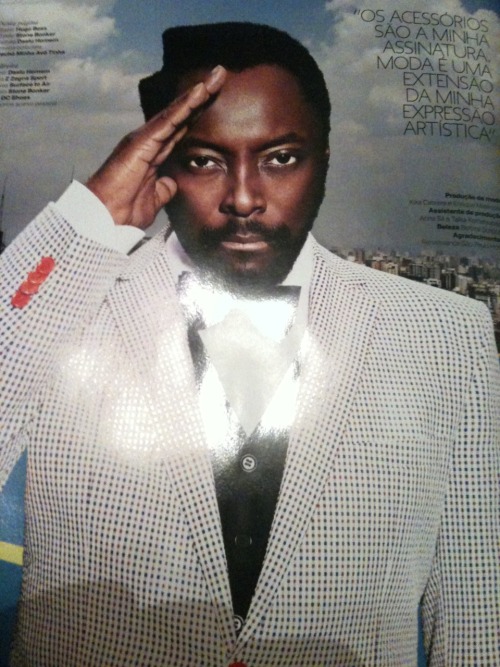
Falando dos editoriais, achei eles fraco, apesar que o material que ilustra a entevista do Will.I.Am tem elementos legais. O blazer xadrez da Daslu Homem é desejo puro (foto acima).
É isso. Se você tem iPad, a revista pode ser baixada de graça esse mês. Caso negativo, está nas bancas e também tem o site?
Abaixo, algumas imagens da muóóóóda da revista! Ah, já ia me esquecendo, o que você achou?
Não sei se esse primeiro número foi feito para bater de frente com a VIP ou se a revista seguirá essa pegada (espero que não), mas existe ali muito campo e potencial para crescer e inovar, principalmente se a revista entender que existe uma grande faixa de mercado aí de vinte e poucos anos que se alimenta basicamente do que é publicado em blogs.
De todas as seções a que mais me deixou chocado, e não foi no bom sentido, foi a nossa querida editoria de moda. Explico, por ser uma revista que deveria tratar a moda com um cuidado especial e destaque, jogou muito no seguro, e, ao invés de inspirar, não provocou desejo algum.
Chamada de Manual, a seção se perde no que poderia ser exitoso. Várias páginas com acessórios variados que me fazem pensar no que virá no mês que vem, já que nessa edição foi tratado de lenços, meias e óculos de sol. Faltou um pouco de brain aí para inovar. Acho incrível, por exemplo, a seção Dig the new (old) da irmã americana que traz os achados do editor de moda.
Outro pecado. Entrevista com Paul Smith sem mostrar uma foto do que ele faz. O cara é incrível, mas no Brasil ele não é nada pop. Faltou aí, mais uma vez, essa mão de selecionar, sei lá, os 10 best buy da marca.
Outra bola fora foi a matéria de camisa xadrez (Tabuleiro Fashion). Esse foi o tema central da GQ americana de março. Tudo feito perfeitamente e editado na medida. Ficou parecendo cópia. Acho que uma das fotos é a mesma da publicação americana.
Falando dos editoriais, achei eles fraco, apesar que o material que ilustra a entevista do Will.I.Am tem elementos legais. O blazer xadrez da Daslu Homem é desejo puro (foto acima).
É isso. Se você tem iPad, a revista pode ser baixada de graça esse mês. Caso negativo, está nas bancas e também tem o site?
Abaixo, algumas imagens da muóóóóda da revista! Ah, já ia me esquecendo, o que você achou?
***
"Who was expecting a commercial fashion bible, as if you write here, got a little upset with what he saw, although with the amazing quality of some sections, especially in version iPad. The exercises, for example, was amazing with the video of the first movements of each series.
I do not know if that first paragraph was made to clash with the VIP or the magazine will follow the footprint (I hope not) but there is much scope and potential to grow and innovate, especially if the magazine understand that there is a great track market there for twenty-somethings who eat mostly what is posted on blogs.
Of all the sections that most shocked me, and was not in a good way, was our dear editors of fashion. Explain, because it is a magazine that fashion should treat with special care and emphasis, played a lot on insurance, and instead of inspiring, did not provoke any desire.
Called Manual, the section is lost in what might be successful. Several pages with various accessories that make me think of what will come next month since that issue was dealt with scarves, socks and sunglasses. It lacked a little brain there to innovate. I find it incredible, for example, the section Dig the new (old) sister American who brings the findings of the fashion editor.
Another cardinal sin. Interview with Paul Smith without showing a photo of what he does. The guy is awesome, but in Brazil is nothing pop. Missed then once more that hand selecting whatever the 10 best buy brand.
Another ball was outside the field of plaid shirt (board fashion). This was the theme of American GQ March. Everything done perfectly and edited on the measure. It looks like a copy. I think one of the photos is the same as the American publication.
Speaking of editorials, I found them weak, despite the material that illustrates the entevista Will.I.Am has the legal elements. The blazer Chess is pure desire Daslu Man (pictured above).
That's it. If you have iPad, the journal can be downloaded for free this month. If not, is on newsstands and is also the site?
Below are some views of muóóóóda magazine! Oh, before I forget, what did you think? (Translated by Google)"
segunda-feira, março 28, 2011
Velho Chico por Ronaldo Fraga
Inspirada na coleção de verão 2009 desfilada por Ronaldo Fraga em julho de 2008 na São Paulo Fashion Week, nasceu a exposição itinerante “Rio São Francisco Navegado por Ronaldo Fraga” (site aqui), que chega a São Paulo no dia 1° de abril, no Pavilhão das Culturas, no Parque Ibirapuera (entrada pelo Portão 10).
Com 13 salas-instalações distintas, a exposição resgata a cultura da região do Velho Chico, reinterpretada por Ronaldo. Com entrada gratuita, vale muito dar uma passada (a exposição vai até 26 de junho).
Ah, para ver os looks do desfile de Ronaldo Fraga verão 2009, clique aqui.
***
"Inspired by summer 2009 collection paraded by Ronaldo Fraga in July 2008 in Sao Paulo Fashion Week, was born the exhibition "Rio São Francisco by Ronaldo Fraga, " which arrives in Sao Paulo on April 1, in Hall of Cultures Ibirapuera Park (entry through Gate 10).
With 13 rooms, separate facilities, the exhibition captures the culture of the region's Old Boy, reinterpreted by Ronaldo.
With free entry, is worth giving a Ibirapuera passed by to see the exhibition.
Ah, to see the looks of the parade of Ronaldo Fraga summer 2009, click here. (Translated by Google)"
Com 13 salas-instalações distintas, a exposição resgata a cultura da região do Velho Chico, reinterpretada por Ronaldo. Com entrada gratuita, vale muito dar uma passada (a exposição vai até 26 de junho).
Ah, para ver os looks do desfile de Ronaldo Fraga verão 2009, clique aqui.
***
"Inspired by summer 2009 collection paraded by Ronaldo Fraga in July 2008 in Sao Paulo Fashion Week, was born the exhibition "Rio São Francisco by Ronaldo Fraga, " which arrives in Sao Paulo on April 1, in Hall of Cultures Ibirapuera Park (entry through Gate 10).
With 13 rooms, separate facilities, the exhibition captures the culture of the region's Old Boy, reinterpreted by Ronaldo.
With free entry, is worth giving a Ibirapuera passed by to see the exhibition.
Ah, to see the looks of the parade of Ronaldo Fraga summer 2009, click here. (Translated by Google)"
quinta-feira, março 24, 2011
Boas compras - Reserva
Uma das marcas mais bacanas do momento, a Reserva (@RESERVATWEET), assim como Osklen e Sérgio K, vestem os meninos contemporâneos no Brasil de hoje. Com uma pegada bastante jovem, a marca assim se define:
“Somos muito barulhentos. Adoramos ouvir e fazer barulho, em alto e bom som.
Somos passionais, preferimos o beijo ao aperto de mão, preferimos o sorriso ao blasé.
Somos quentes, inverno e verão.
Somos saudáveis de corpo e alma.
Somos pessoas que realizam sonhos, não empreendedores.
Somos completamente apaixonados pela vida, somos família, somos acolhedores.
Somos verdadeiros, conosco e com o próximo.
Somos simples, assim como a vida que vivemos intensamente.
Somos gentis e educados sob qualquer circunstância.
Somos inquietos, talvez por isso queremos nos reinventar a cada segundo.
Somos nós mesmos, mas não sempre os mesmos.
Somos – todos nós – a Reserva.”
Dessa mistura nasce o conceito das coleções da marca, que não são super profundos, mas interessante a ponto de se tornarem desejo.
Outro ponto forte é a identidade criada com seus consumidores e a o jeito carioca de deixar todo mundo à vontade. Música, cerveja gelada e bate-papo fazem parte desse processo.
Falando de roupa, que é afinal o que nos interessa, nada de original, mas tudo perfeitamente trabalhado e usável. Não espere encontrar na Reserva modelagens novas, formatos novos, é sempre o básico do guarda-roupa masculino reeditado de uma forma super bacana e atual.
Entre os clássicos da marca estão as camisetas pólo e as bermudas de praia. Malharia bacana e tênis. Além de algumas camisas. Veja aqui como foi o último desfile apresentado na São Paulo Fashion Week.
***
"One of the coolest brands of the moment, the Reserve () and Sergio Osklen and K, the boys dress in contemporary Brazil today. With a footprint very young, the brand defines itself thus:
'We are very noisy. We love to hear and make noise, loud and clear.
We are passionate, we prefer the kiss to handshake, smile to
the blasé.
We are warm in winter and summer.
We are healthy in body and soul.
We are people who realize dreams, not employers.
We are completely passionate about life, we are family, we are welcoming.
We're real, with ourselves and others.
We are simple, like the life we live intensely.
We are kind and respectful in any circumstance.
We are anxious, so maybe we reinvent ourselves every second.
Ourselves, but not always the same.
We - all of us - the Book. "
This mix was born the concept of the collections of the brand that are not super deep, but interesting enough to become desire.
Another strong point is the identity created with its consumers AoS Carioca way to let everyone at ease. Music, cold beer and chat are part of that process.
Speaking of clothing, which is ultimately what we want, nothing original, but everything worked perfectly and usable. Do not expect to find on the new reserve modeling, new formats, it is always the basics of the male wardrobe reissued in a super cool and current.
Among the classics of the brand are the shirts and shorts polo beach. Knitting and cool sneakers. Besides a few shirts. Here's how the last parade was presented at São Paulo Fashion Week. (Translated by Google)"
“Somos muito barulhentos. Adoramos ouvir e fazer barulho, em alto e bom som.
Somos passionais, preferimos o beijo ao aperto de mão, preferimos o sorriso ao blasé.
Somos quentes, inverno e verão.
Somos saudáveis de corpo e alma.
Somos pessoas que realizam sonhos, não empreendedores.
Somos completamente apaixonados pela vida, somos família, somos acolhedores.
Somos verdadeiros, conosco e com o próximo.
Somos simples, assim como a vida que vivemos intensamente.
Somos gentis e educados sob qualquer circunstância.
Somos inquietos, talvez por isso queremos nos reinventar a cada segundo.
Somos nós mesmos, mas não sempre os mesmos.
Somos – todos nós – a Reserva.”
Dessa mistura nasce o conceito das coleções da marca, que não são super profundos, mas interessante a ponto de se tornarem desejo.
Outro ponto forte é a identidade criada com seus consumidores e a o jeito carioca de deixar todo mundo à vontade. Música, cerveja gelada e bate-papo fazem parte desse processo.
Falando de roupa, que é afinal o que nos interessa, nada de original, mas tudo perfeitamente trabalhado e usável. Não espere encontrar na Reserva modelagens novas, formatos novos, é sempre o básico do guarda-roupa masculino reeditado de uma forma super bacana e atual.
Entre os clássicos da marca estão as camisetas pólo e as bermudas de praia. Malharia bacana e tênis. Além de algumas camisas. Veja aqui como foi o último desfile apresentado na São Paulo Fashion Week.
***
"One of the coolest brands of the moment, the Reserve () and Sergio Osklen and K, the boys dress in contemporary Brazil today. With a footprint very young, the brand defines itself thus:
'We are very noisy. We love to hear and make noise, loud and clear.
We are passionate, we prefer the kiss to handshake, smile to
the blasé.
We are warm in winter and summer.
We are healthy in body and soul.
We are people who realize dreams, not employers.
We are completely passionate about life, we are family, we are welcoming.
We're real, with ourselves and others.
We are simple, like the life we live intensely.
We are kind and respectful in any circumstance.
We are anxious, so maybe we reinvent ourselves every second.
Ourselves, but not always the same.
We - all of us - the Book. "
This mix was born the concept of the collections of the brand that are not super deep, but interesting enough to become desire.
Another strong point is the identity created with its consumers AoS Carioca way to let everyone at ease. Music, cold beer and chat are part of that process.
Speaking of clothing, which is ultimately what we want, nothing original, but everything worked perfectly and usable. Do not expect to find on the new reserve modeling, new formats, it is always the basics of the male wardrobe reissued in a super cool and current.
Among the classics of the brand are the shirts and shorts polo beach. Knitting and cool sneakers. Besides a few shirts. Here's how the last parade was presented at São Paulo Fashion Week. (Translated by Google)"
RIP Elizabeth Taylor
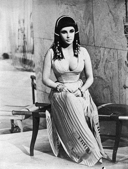
See here a tribute for the fashion icon Elizabeth Taylor. Above, photo from Cleopatra, 1963.
Assinar:
Postagens (Atom)