
Não sei se cor-de-rosa pega, mas essa coleção da Versace para H&M que tem um terno rosa como um de seus carros-chefes me fez pensar
no uso das cores e em como pode ser divertido brincar com elas.
Desde o color block (mistura de cores que se contrastam em
um mesmo look, como verde e rosa), há umas duas temporadas, as cores vem
ganhando cada vez mais espaço, assim como as estampas.
Essa coleção da Versace para a fast fashion confirmam isso
ainda mais e nos dão uma possibilidade gigante de levar isso para o dia-a-dia
sem parecer fantasia.
Se você está se perguntando como, aqui vão algumas dicas
(isso é o que eu faço na minha vida):
- cores: curto a ideia do color block, mas sempre tempo
balancear uma cor mais forte com uma mais apagada, para não parecer editorial
de revista, saca!!! Gosto de colocar a parte de baixo azul e brincar com as
camisetas.
- cor: ando gostando bastante de looks monocromáticos.Nesse
caso o segredo é manter o mesmo tom e variar a padronagem. Fica bacana porque
tem um toque fashion, mas não é nada fantasioso. Só cuidado com as cores.
- estampas: essas resolveram voltar com tudo. A ideia e usar
apenas uma peça estampada. Camisa ou camiseta é sempre mais fácil de se
combinar e acertar que calça. Aí a combinação é com neutros. Se você ainda não
tem muita seguraça no look, joga uma peça neutra por cima, que pode ser um
cardigã ou uma malha v, assim a estampa fica apenas no detalhe.
+ 1: para iniciados – se você é bem seguro de si, acho super
bacana combinar estampados com tecidos gráficos. Aí o bom sendo fala mais alto.
É provar o look e ver se ele funciona, certo?
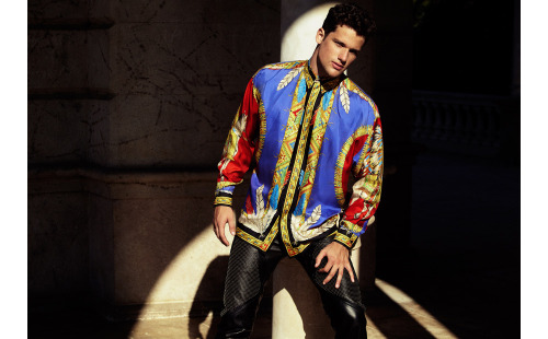
Veja, abaixo, alguns editoriais que saíram com a coleção da Versace para H&M:

Sander H by Michele de Andreis to The Fashionisto. Full editorial here.

Arthur Sales by Nacho Alegre to Hercules Universal. Full editorial here.
***
"I do not know if color pink handle, but this Versace collection for H & M has a pinksuit as one of their chiefs cars made me think of the use of color and how it can befun to play with them.
Since the color block (mix of colors that contrast in the same look as green and pink), there are two seasons, the color is gaining more space, as well as prints."I do not know if color pink handle, but this Versace collection for H & M has a pinksuit as one of their chiefs cars made me think of the use of color and how it can befun to play with them.
This collection of Versace for the fast fashion further confirm this and give us a chance to take this giant of the day to day without seeming fantasy.
If you're wondering how, here are some tips (that's what I do in my life):
- Color: short the idea of color block, but always time to balance a more intense color with a dimmer, not to sound editorial magazine, you know! I like to put the bottom and play with the blue shirts.
- Color: walk monocromáticos.Nesse looks like it enough if the key is keeping thesame tone and vary the pattern. It is cool because it has a fashion touch, but it's nothing fancy. Just watch out for colors.
- Prints: these decided to return everything. The idea is to use only one piecestamped. Shirt or t-shirt is always easier to combine and hit you wear. So with the combination is neutral. If you do not have a lot of safety in the look, plays a neutralpiece on top that can be a knitted cardigan or v, so the pattern is only in detail.
+ 1: for beginners - if you are very sure of himself, I think super cool graphicscombine patterned fabrics. There is good talks. It is proving the look and see if it works, right?
See below some editorials that came with the Versace collection for H & M. (Translation by Google)"
Nenhum comentário:
Postar um comentário